Interior design: How materials enhance living environments
While the exterior of the home establishes the overall impression of the entire property, the interior balances personal comfort and style with functionality and lifestyle. Interior finishes should work with the architecture, and since I mostly work in the modern design arena, it’s really about fine-tuning within that style.
It comes down to working with the materials’ qualities to craft an interior that is comfortable and makes you feel good. When designing my own home, I wanted to keep the focus on the views of the exterior—so I made the interiors more minimal, so they work more as a backdrop. I achieved this by using a small amount of texture and decorative materials, which keeps your visual attention on the landscape.
When selecting materials for people’s dream homes, I balance four key design elements to craft their interiors.
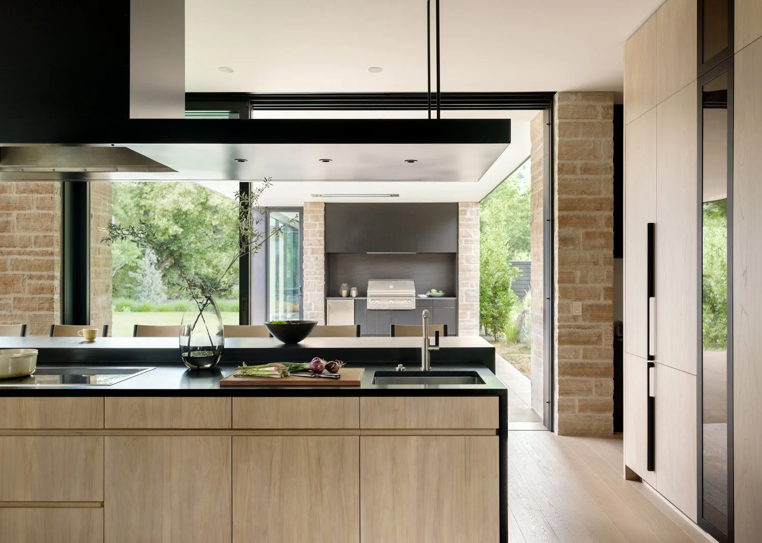
Bring the outside in. As with my house, there is a growing desire to visually connect our interiors to nature and exterior spaces. Floor-to-ceiling windows and large sliding doors make the interior spaces feel connected to the exterior and also make a home feel larger. The interior finishes can take this a step further by visually blurring the boundaries by bringing the same materials on the outside as inside. For example, on the Portal House, the stone veneer wraps the columns and flows into the interior space. So, when the doors are open, the line between indoors and outdoors is really blurred.
I like to use wood on the exterior ceiling—and this is another great place to extend the outside materials in. On the ceiling, wood is protected from the elements and fosters a sense of warmth and interconnectedness to nature when carried from the exterior into the interior.
Dial up or down the contrast. High contrast adds drama, while low contrast feels soothing and relaxing. I adjust the contrast to suit homeowners’ personalities and goals to create a home that feels good to them.
Below, you can observe how minimal contrast fosters a serene and tranquil environment. The light, neutral color palette contributes to this calming effect.
Now, notice the difference in the New Century Modern home below. Even though the materials are similar, this one has higher levels of contrast, which brings in more visual stimulation.
Play with texture and pattern. This is where you can infuse depth and personality into the space. Using various textures in a space provides visual contrast. Most homes have a large amount of drywall—so adding wood paneling, stone veneer or tile—all which have different textual qualities—is a great way to bring in some warmth and visual interest. Think of how a slat wood wall brings warmth to a space, or how a small mosaic tile with lots of grout joints adds a high level of texture to a backsplash.
While I tend to use less, patterns bring a lot of personality to a space. Think decorative tiles with fun prints or interesting shapes. Furnishings also provide a great opportunity for softening a space and texture and contrast—like shaggy rugs, textured pillows, a contrasting accent chair or chunky throw blankets.
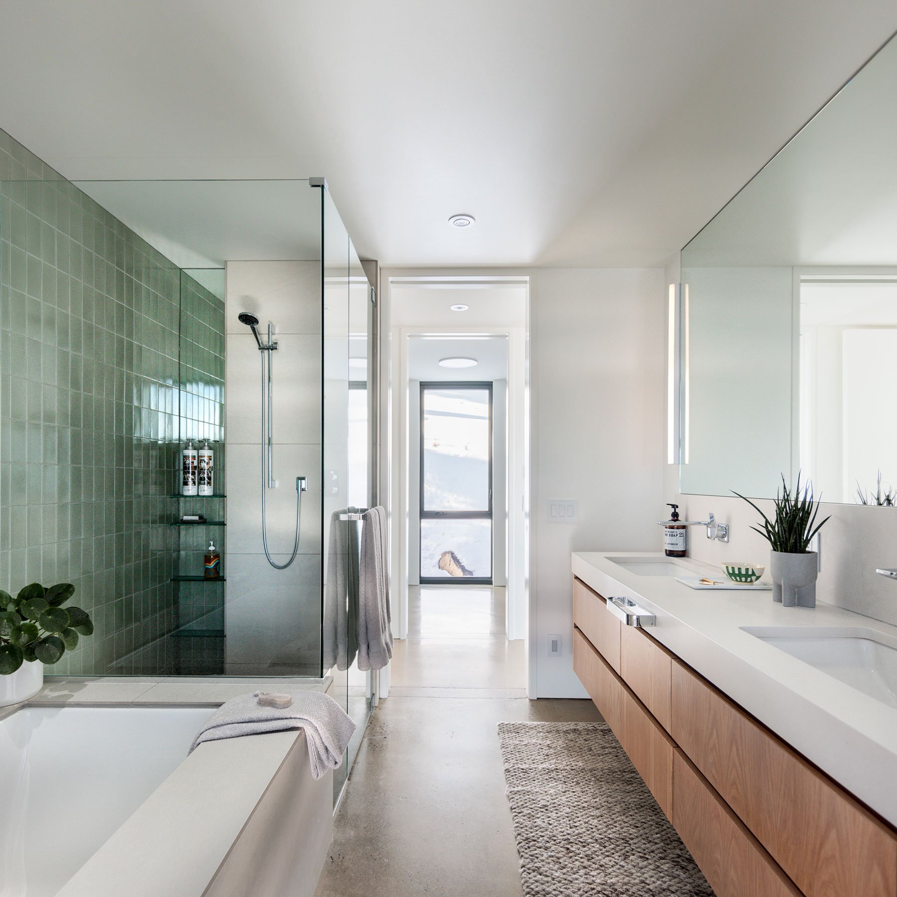
Mindfully arrange the color palette. Since color trends cycle pretty quickly, I bring color into elements that can be changed out quickly and painlessly, like pillows and paint. However, it is also fun to bring color into unexpected places, such as this muted green and yellow I introduced into my own bathrooms. In the context of a minimalist space, the colors make bold statements.
Are you interested in building a home? Let’s schedule a call to connect. I’d love to hear about what you envision.


